Daily Logo Challenge
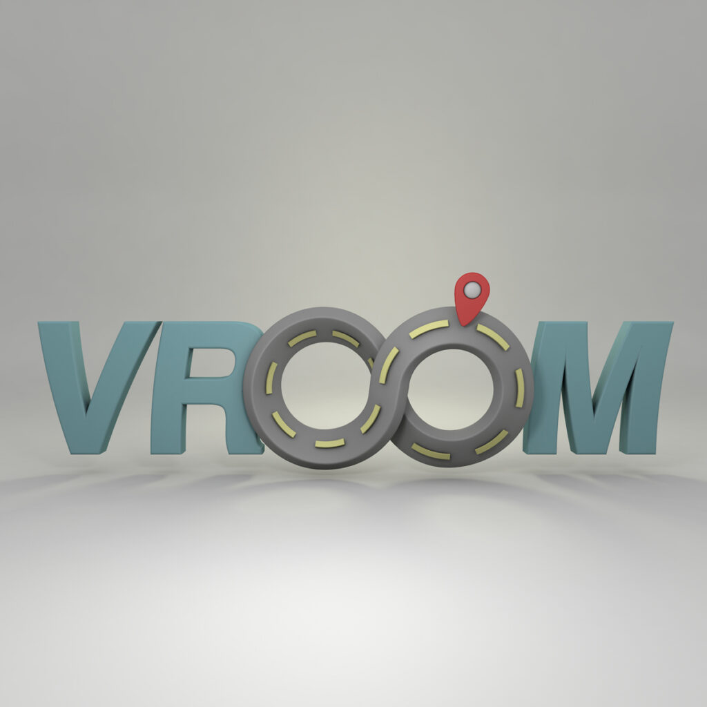
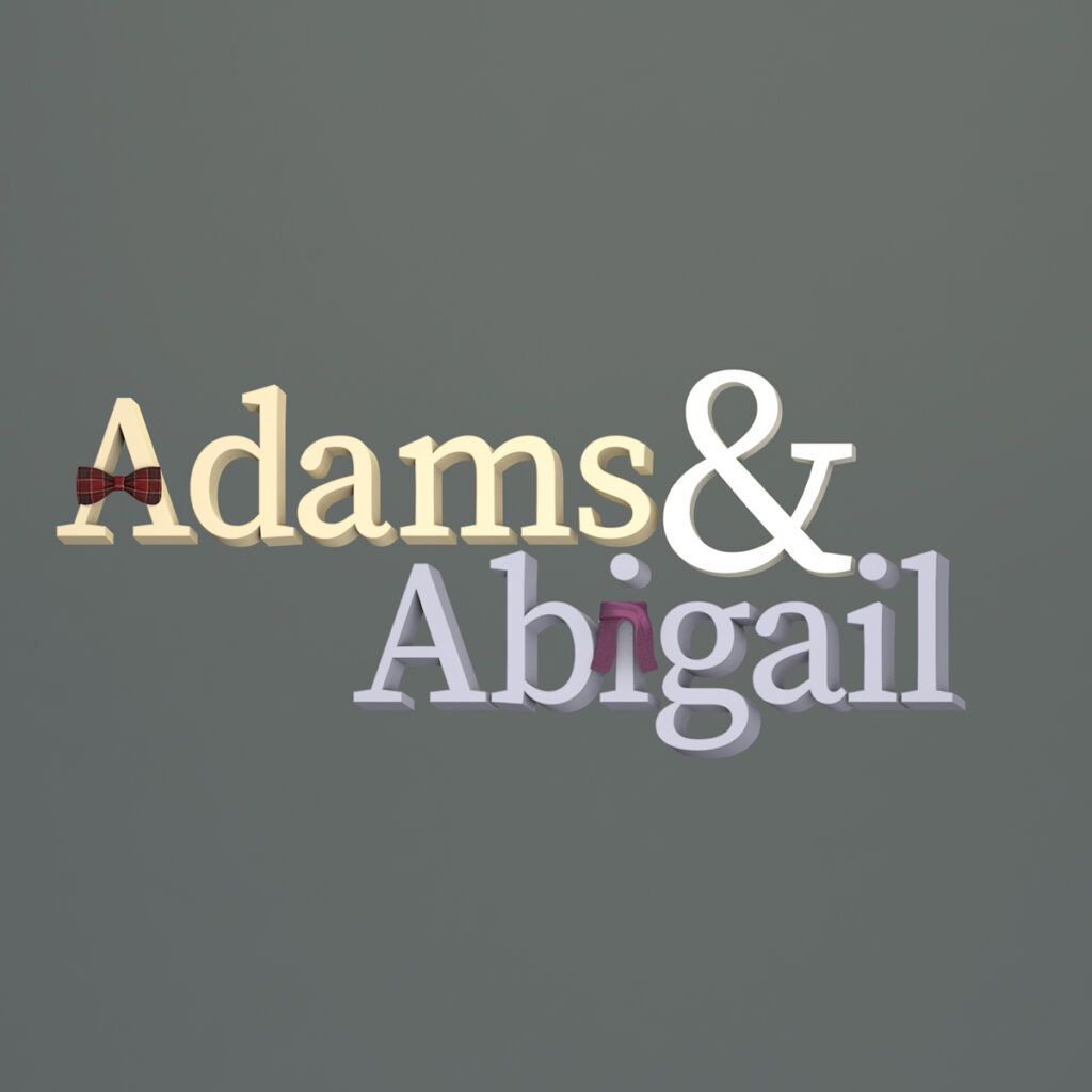
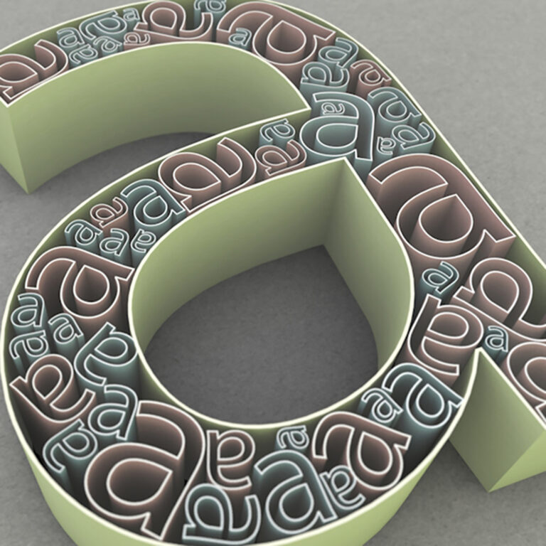
With a small amount of anxiety I decided to take on the Daily Logo Challenge . Anyone who has attempted this knows that Harris will email you a daily design brief usually consisting of an image and a few names you can choose to place in your design. This in itself can seem like a daunting task, yet I decided to up the challenge by experimenting with designing my logos in 3D space using 3D modeling software. Before you get to excited about this I should mention that generally speaking, this is a terrible idea! Most modern logos are designed to be delivered as a polished vector file. This way the logo is scalable and because it is made up of mathematical curves the logo can also support CNC machines for fabrication, etc. Seeing as how the final designs were for experimentation only and not an actual client, I decided I could live with the consequences of having a bitmapped logo. I also established a few ground rules while designing the logos. First, the logo needs to work well in 2D space. When sketching the logos I tried to designed them in a 2D environment knowing that later the 3D application would hopefully make it look a little bit slicker. Second, don’t rely on cliche 3D software rendering tricks, like fur or shiny metals. Basically, don’t let the3D software dictate the design! Come up with a solid concept and let the 3d space enhance that concept, not the other way around. With all that in mind, here are some of the final logo designs.
#dailylogochallange #dailylogo #HarrisGivesMeAnxiety
Animated Logos!
Since posting this, I have animated a few of the logos!
I’d be very curious to hear your thoughts on this process. Does the 3d rendering enhance the message or is this just a gimmick in an attempt to salvage a poor design concept?
